
Introduction
In this article, we are going to learn how to design Jira Board like UI using React with Tailwind CSS and how to manage its state using Context API. Also we are going to implement our own custom Drag and Drop feature by implementing reusable custom hooks.
We are going to implement the whole feature in this post, so it is better to plan step by step how we can approach the problem. I am going to divide the whole problem into three steps:
- Designing and implementing the UI
- what should be optimal component hierarchy for this UI.
- How does the data flow work with the proposed component design considering performance scenarios like minimizing extra re-renders.
- Managing the state of the component hierarchy
- What should be the interface of the state for the UI
- How can we optimize state design
- Implementing Drag and Drop feature.
- Implementing custom hooks for the Drag and Drop
- Using custom hooks in our UI.
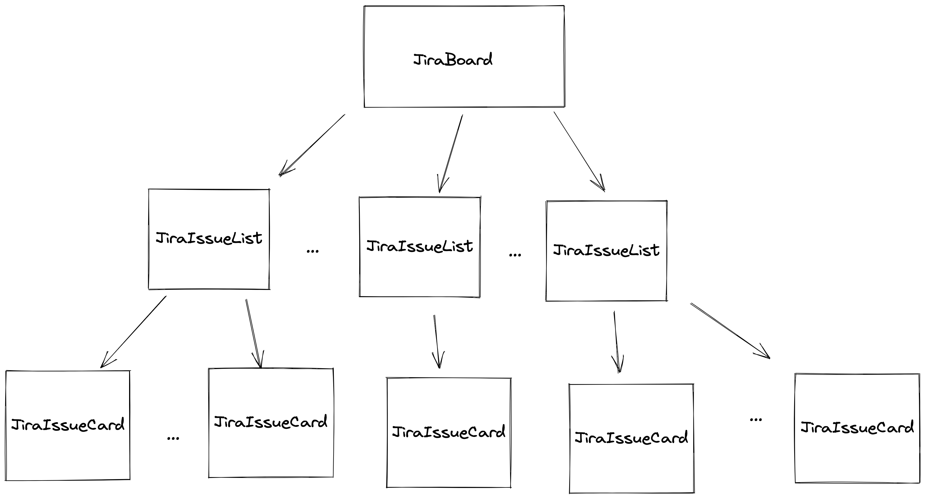
Deciding Component Hierarchy 🧐
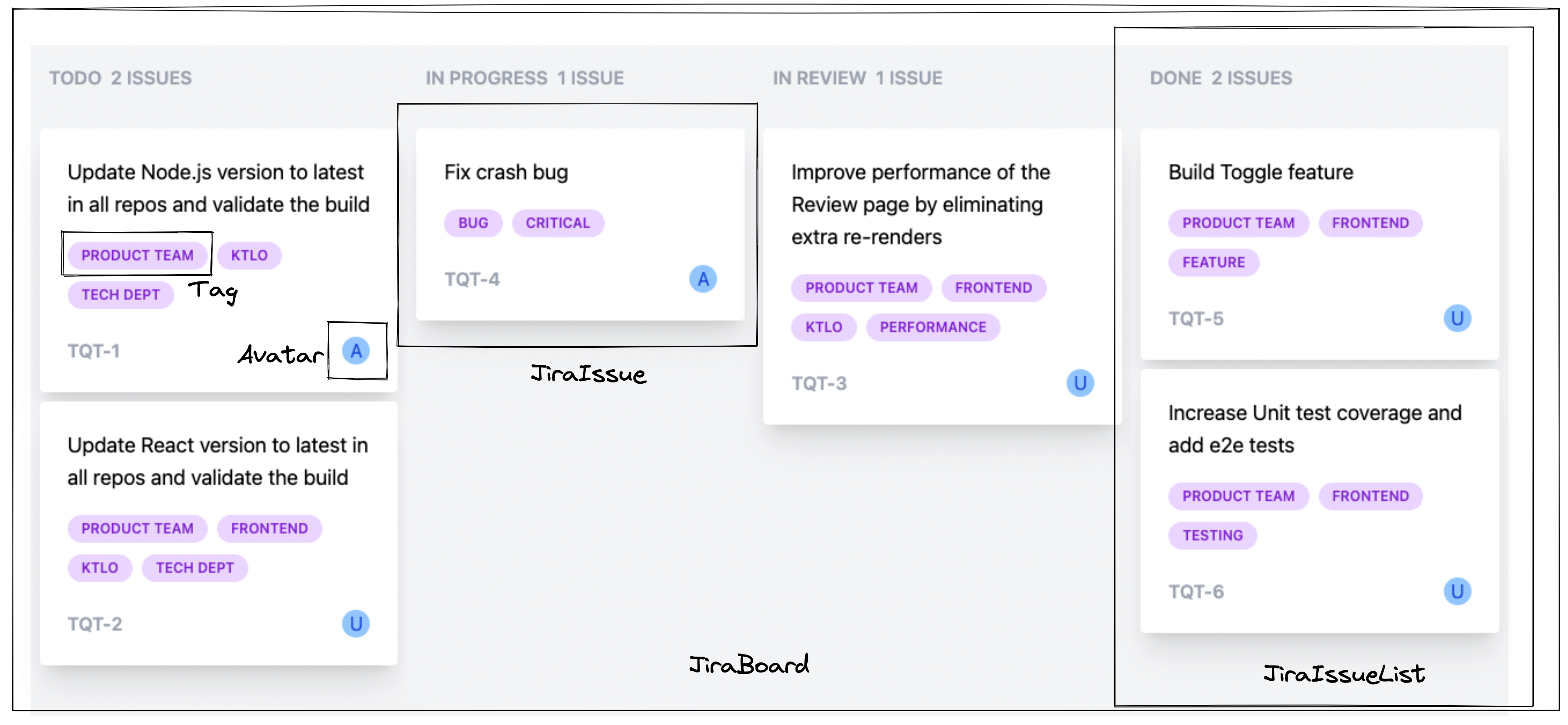
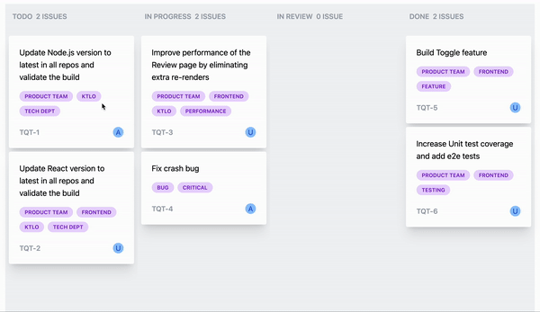
If you observe the UI, at higher level, we can see three main components:
- Jira Issue card which displays jira issue details like title, tags, assignee etc. and is draggable so that it can be moved to different status.
- Jira Issue list which displays list of all jira issues belonging to a particular status so will hold multiple Jira Issue cards.
- Jira Board which displays a separate list of issues for each jira status thus contains multiple Jira Issue Lists.
so the component hierarchy looks like:
Data Structure and Data Flow through Component hierarchy
Based on the UI, the data for a Jira Issue has following interface:
type JiraIssue = {
    id: string;
    title: string;
    status: JiraIssueStatus;
    tags: string[];
    user?: string;
}
JiraIssueStatus:
type JiraIssueStatus = "TODO" | "IN PROGRESS" | "IN REVIEW" | "DONE";
JiraBoard will have a list of jira issues. It will then normalize the data by status and then render list of JiraIssueList for different issue status. JiraIssueList will have a list of jira issues for a given status and then render multiple JiraCard components. This is the simple component hierarchy and data flow among them i can think of.
Before we go ahead with components implementation, let's think and implement the state management for the component hierarchy.
State management
We have two usecases here:
JiraBoardcomponent need to get access to the list of jira issues,JiraIssueListneed to have a function to update the state i.e. jira issue list whenever user drags or moves a jira issue from one status to a different one.
There can be multiple approaches for managing the state:
- Simple one is, We can define state in
JiraBoardcomponent and usepropssystem to pass data to the child components. - Another approach is, We can use
React Context APIfor the state management.
I am going with the second approach 🫠.
I am not a fan of keeping referencial state in the context because sometimes it results in unneccessary re-rendering of the components. To know more about this behaviour, you can go through my post on React Context API.
We are going to have two different contexts:
- one for list of jira issues
- another one for the update function to update status of a jira issue
Let's see the implementation:
import React, { createContext, useCallback, useState } from "react";
import { Dictionary } from "lodash";
import jiraIssues from "./data";
import { JiraIssue, JiraIssueStatus } from "./type";


type UpdateIssueStatus = ((id: string, status: JiraIssueStatus) => void) | null;

export const JiraIssueContext = createContext<Dictionary<JiraIssue>>({});
export const JiraIssueUpdaterContext = createContext<UpdateIssueStatus>(null);

const JiraIssueProvider = ({ children }: { children: React.ReactNode }) => {
    const [issues, setIssues] = useState(jiraIssues);

    const updateIssueStatus = useCallback((id: string, status: JiraIssueStatus) => {
        setIssues(issues => ({
            ...issues,
            [id]: {
                ...issues[id],
                status,
            }
        }));
    }, []);

    return (
        <JiraIssueUpdaterContext.Provider value={updateIssueStatus}>
            <JiraIssueContext.Provider value={issues}>
                {children}
            </JiraIssueContext.Provider>
        </JiraIssueUpdaterContext.Provider>
    );
};

export default JiraIssueProvider;
If we notice the type of data in JiraIssueContext, it is Dictionary<JiraIssue>. Dictionary is a simple key-value pair type defined in lodash having interface as:
interface Dictionary<T> {
  [index: string]: T;
}
so, in our case, data i.e. list of jira issues looks like:
const data: JiraIssue[] = [
    {
        id: "TQT-1",
        title: "Update Node.js version to latest in all repos and validate the build",
        user: "Altamash",
        tags: ["Product Team", "KTLO", "Tech Dept"],
        status: "TODO"
    },
    {
        id: "TQT-2",
        title: "Update React version to latest in all repos and validate the build",
        tags: ["Product Team", "Frontend", "KTLO", "Tech Dept"],
        status: "TODO"
    },
    {
        id: "TQT-3",
        title: "Improve performance of the Review page by eliminating extra re-renders",
        tags: ["Product Team", "Frontend", "KTLO", "Performance"],
        status: "IN PROGRESS"
    },
];
We are converting the data into dictionary with key as Jira Issue id using lodash.keyby method:
import _keyBy from 'lodash.keyby';

const jiraIssues = _keyBy(data, 'id');
After that, our data look like:
{
    "TQT-1": {
        id: "TQT-1",
        title: "Update Node.js version to latest in all repos and validate the build",
        user: "Altamash",
        tags: [
            "Product Team",
            "KTLO",
            "Tech Dept"
        ],
        status: "TODO"
    },
    "TQT-2": {
        id: "TQT-2",
        title: "Update React version to latest in all repos and validate the build",
        tags: [
            "Product Team",
            "Frontend",
            "KTLO",
            "Tech Dept"
        ],
        status: "TODO"
    },
    "TQT-3": {
        id: "TQT-3",
        title: "Improve performance of the Review page by eliminating extra re-renders",
        tags: [
            "Product Team",
            "Frontend",
            "KTLO",
            "Performance"
        ],
        status: "IN PROGRESS"
    },
}
Idea behind converting the list to dictionary is: it will be more efficient to update the list in case of dictionary as we don't have to iterate over the list of issues to find the issue by id. We can directly use id as index to update the state:
const updateIssueStatus = useCallback((id: string, status: JiraIssueStatus) => {
        setIssues(issues => ({
            ...issues,
            [id]: {
                ...issues[id],
                status,
            }
        }));
    }, []);
You can also notice, we are using useCallback hook so that function reference remains the same whenever components re-render.
Also, ordering of the Providers matter because as a thumb rule, whenever parent component renders, its child components will also renders. Since updateIssueStatus reference is going to be same during multiple rerenders, and issues state will be updated frequently, it makes sense to keep JiraIssueUpdaterContext.Provider ahead of JiraIssueContext.Provider.
return (
        <JiraIssueUpdaterContext.Provider value={updateIssueStatus}>
            <JiraIssueContext.Provider value={issues}>
                {children}
            </JiraIssueContext.Provider>
        </JiraIssueUpdaterContext.Provider>
    );
Now, we are done with the state implementation. Let's go ahead with the components implementation:
Components implementation
JiraCard
If you look at the JiraCard, we need to display:
- a jira card title,
- list of tags
- ticket id
- an avatar
I will be using tailwind-styled-components to style components with tailwind css.
import tw from "tailwind-styled-components";
let's implement sub-components Tag and Avatar first:
Tag
export const Tag = tw.span`
    inline-block
    bg-purple-200
    rounded-full
    px-3
    py-1
    text-xs
    font-semibold
    text-purple-700
    mr-2
    mb-2
    uppercase
`;
Avatar
const Avatar = tw.div`
    p-3
    w-4
    h-4
    rounded-full
    flex
    justify-center
    items-center
    bg-blue-300
    text-blue-700
`;
Now, let's see JiraCard implementation:
Prop type will be same as JiraIssue type:
export type Props = JiraIssue;
We can define container for the card using styled component to have some shadow and rounded corners:
const JiraCardContainer = tw.div`
    max-w-sm
    p-2
    rounded
    overflow-hidden
    shadow-xl
     bg-white
`;
const JiraCard = ({ title, tags, id, user }: Props) => {

    return (
        <JiraCardContainer key={id}>
            <div className="p-4 flex flex-col justify-around items-start gap-4">
                <div className=" text-lg">{title}</div>
                <div>
                    {tags.map(tag => (
                        <TagStyledComponent key={tag}>{tag}</TagStyledComponent>
                    ))}
                </div>
                <div className="flex justify-between w-full">
                    <div className=" font-semibold text-gray-400">{id}</div>
                    <Avatar>{user?.charAt(0) ?? "U"} </Avatar>
                </div>
            </div>
        </JiraCardContainer>
    );
}

export default memo(JiraCard);
You may notice that how simple it is to style components using tailwind CSS 😍 and flex is what i use almost everywhere 😝. Also, I have wrapped the JiraCard component with React.memo to avoid re-rendering in case props remains the same.
Next component is 🥸
JiraIssueList
export type Props = {
    status: JiraIssueStatus;
    issues: JiraIssue[];
}

const Container = tw.div<>`
    p-2
    flex
    flex-col
    gap-2
    bg-gray-100
    min-w-[300px]
    min-h-screen
`;


const JiraIssueList = ({ status, issues }: Props) => {
    const numberOfIssues = `${issues?.length ?? 0} ${(issues?.length ?? 0) > 1 ? "issues" : "issue"}`;

    const renderedIssues = useMemo(() => {
        return issues && issues.map(issue =>
            <JiraCard
                key={issue.id}
                {...issue}
            />
        )
    }, [issues]);

    return (
        <Container key={status}>
            <div className="font-semibold text-gray-400 uppercase mb-4 p-2">
                <span>{status}</span>
                <span className="ml-2">{numberOfIssues}</span>
            </div>

            {renderedIssues}

        </Container>
    );
};

export default JiraIssueList;
Now that, we have JiraIssueList component implemented, let's go for final JiraBoard component:
JiraBoard
import { useContext, useMemo } from "react";

import { JiraIssueContext } from "./context";
import groupBy from "lodash.groupby";
import { JiraIssue, JiraIssueStatus } from "./type";
import JiraIssueList from "./jira-issue-list";

const jiraIssueStatusList: JiraIssueStatus[] = ["TODO", "IN PROGRESS", "IN REVIEW", "DONE"];

const JiraBoard = () => {
    const issues = useContext(JiraIssueContext);

    // group the data by status
    const issuesByStatus = useMemo(() => {
        return groupBy(Object.values(issues), 'status') as Record<JiraIssueStatus, JiraIssue[]>;
    }, [issues]);

    return (
        <div className=" w-full flex items-center justify-around">
            {jiraIssueStatusList.map((status) =>  <JiraIssueList
                key={status}
                status={status}
                issues={issuesByStatus[status]}
            />
            )}
        </div>
    );
}

export default JiraBoard;
Here, we are getting access to the state i.e. jira issues using JiraIssueContext. Then we are grouping the issues by status using lodash.groupby method. Then iterating over the status list and rendering JiraIssueList for each status.
Also, ✋ don't forget to wrapped JiraBoard with JiraIssueProvider to access the context we have defined:
<JiraIssueProvider>
    <JiraBoard />
</JiraIssueProvider>
With that, we are done with component design and implementations 😮💨.
Now, let's implement drag and drop feature:
Drag and Drop feature implementation
If you are not aware of HTML5 Drag and Drop API, you can go through this awesome blog.
In our usecase, we need to drag (i.e. move) a jira card from one status to another status. As per our component, JiraCard component is going to be dragged🪡 so it is drag target and we are going to drop the JiraCard into JiraIssueList component, so JiraIssueList is drop target.
Events fired on the draggable targets are:
drag- fired every few hundred milliseconds as an element or text selection is being dragged by the user.dragstart- fired when the user starts dragging an elementdragend- fired when a drag operation is being ended (by releasing a mouse button)
and Events fired on the drop targets are:
dragover: fired when an element is being dragged over a valid drop target (every few hundred milliseconds)dragenter: fired when a dragged element enters a valid drop targetdragleave: fired when a dragged element leaves a valid drop targetdrop: fired when an element is dropped on a valid drop target.
We are going to implement two different reusable custom hooks for both drag and drop targets:
useDraggableTargetuseDropTarget
useDraggableTarget hook
This hook can be used when you need to make any element as draggable.
To make an object draggable we need to set draggable=true on that element. Therefore, we need to take ref as a parameter so that our custom hook can set draggable attribute and register/deregister event listeners. Along with that, we need to get optional set of event handlers needed for draggable targets in case user wants to customize the behaviour based on different events. Our hook is going to expose a single boolean state isDragging whenever the element is being dragged by the user.
Here is the implementation:
import { useEffect, useState } from "react";

export type DraggableTargetEventHandlers = {
    drag?: (event: DragEvent) => void;
    dragstart?: (event: DragEvent) => void;
    dragend?: (event: DragEvent) => void;
};


const useDraggableTarget = (
    ref: React.RefObject<HTMLElement>,
    { drag, dragstart, dragend }: DraggableTargetEventHandlers = {},
) => {
    const [isDragging, setIsDragging] = useState(false);

    useEffect(() => {
        if (ref.current) {
            // set the draggable attribute to true to make it draggable
            ref.current.setAttribute('draggable', "true");

            /* register events fired on the draggable target */

            // drag event
            drag && ref.current.addEventListener('drag', drag);

            // dragstart event
            const handleDragStart = (event: DragEvent) => {
                setIsDragging(true);
                dragstart?.(event);
            }
            ref.current.addEventListener('dragstart', handleDragStart);

            // dragend event
            const handleDragEnd = (event: DragEvent) => {
                setIsDragging(false);
                dragend?.(event);
            }
            ref.current.addEventListener('dragend', handleDragEnd);

            /* unsubscribe drag events before unmount */
            return () => {
                drag && ref.current?.removeEventListener('drag', drag);
                ref.current?.removeEventListener('dragstart', handleDragStart);
                ref.current?.removeEventListener('dragend', handleDragEnd);
            };
        }
    }, [ref, drag, dragstart, dragend]);

    return isDragging;
};

export default useDraggableTarget;
useDropTarget hook
This hook can be used when you need to make any element as a drop target.
It is having similar implementation as useDraggableTarget as we would need ref to the element to register event handlers needed for drop targets and an optional custom events handlers config object. We have one boolean state isDragOver defined to indicate if any element is being dragged over our drop target.
Here is the implementation:
import { useEffect, useState } from "react";

export type DropTargetEventHandlers = {
    dragover?: (event: DragEvent) => void;
    dragenter?: (event: DragEvent) => void;
    dragleave?: (event: DragEvent) => void;
    drop?: (event: DragEvent) => void;
};

const useDropTarget = (
    ref: React.RefObject<HTMLElement>,
    { dragover, dragenter, dragleave, drop }: DropTargetEventHandlers = {},
) => {

    const [isDragOver, setIsDragOver] = useState(false);

    useEffect(() => {
        if (ref.current) {
            /* register events fired on the drop target */

            // dragover event
            const handleDragOver = (event: DragEvent) => {
                event.preventDefault();
                setIsDragOver(true);
                dragover?.(event);
            }
            ref.current.addEventListener('dragover', handleDragOver);

            // dragenter event
            const handleDragEnter = (event: DragEvent) => {
                dragenter?.(event);
            }
            ref.current.addEventListener('dragenter', handleDragEnter);

            // dragleave event
            const handleDragLeave = (event: DragEvent) => {
                setIsDragOver(false);
                dragleave?.(event);
            }
            ref.current.addEventListener('dragleave', handleDragLeave);

            // drop event
            const handleDrop = (event: DragEvent) => {
                setIsDragOver(false);
                drop?.(event);
            }
            ref.current.addEventListener('drop', handleDrop);

            /* unsubscribe drag events before unmount */
            return () => {
                ref.current?.removeEventListener('dragover', handleDragOver);
                ref.current?.removeEventListener('dragenter', handleDragEnter);
                ref.current?.removeEventListener('dragleave', handleDragLeave);
                ref.current?.removeEventListener('drop', handleDrop);
            };
        }
    }, [ref, dragover, dragenter, dragleave, drop]);

    return isDragOver;
};

export default useDropTarget;
Now that, we have both hooks implemented. Let's see now how easy it is to implement drag and drop feature.
Implementing dragging in jira Card component
We will be using useDraggableTarget() hook to implement dragging in JiraCard component.
We need to define a ref to the JiraCardContainer using useRef.
Also we need to set the data corresponding to dragged element on the drag event which is id of the jira issue so that we can retrieve it whenever user drops it on the target and update the list. For that, we can add a handler for dragstart event and pass it to the hook. Note that, we are using useMemo so that config object reference doesn't change when id is same and component rerenders.
Also if you check out the gif above, we are setting its opacity to 30% while dragging and set back to 100% when drag is finished. To implement this, We can use the return value of our custom hook dragging and pass it as props to JiraCardContainer styled component to add tailwind classes opacity-30 and opacity-100 based on state.
Check out the changes in JiraCard and JiraCardContainer components:
interface JiraCardContainerProps {
    $dragging: boolean;
}

const JiraCardContainer = tw.div<JiraCardContainerProps>`
    ...
     ${props => props.$dragging ? "opacity-30" : "opacity-100"}
`;

const JiraCard = ({ title, tags, id, user }: Props) => {
    const ref = useRef<HTMLDivElement>(null);

    const dragConfig: DraggableTargetEventHandlers = useMemo(() => ({
        dragstart: ev => {
            if (ref.current && ev.dataTransfer) {
                ev.dataTransfer.effectAllowed = "move";
                ev.dataTransfer.setData("jiraIssueId", id);
            }
        }
    }), [ref.current, id]);

    const dragging = useDraggableTarget(ref, dragConfig);

    return (
        <JiraCardContainer key={id} ref={ref} $dragging={dragging}>
            ...
        </JiraCardContainer>
    );
}
Implementing drop in JiraIssueList component
To implement drop feature in JiraIssueList, we can use useDropTarget hook which needs a reference to the drop target element. We will create a reference to Container component and pass the same ref to the hook.
We need to update the state whenever user drops the card to the list. For that, we need to get access to the updateJiraIssueStatus function using JiraIssueUpdaterContext context, then we need to implement drop event handler and retrieve id from the event object and call the update function with id and new status of the card.
Also whenever user drags over an element to the target element, we are setting the border of the targer list to show something is being dragged over here. To implement that, we can use isDragOver boolean state returned by our custom hook and pass it to the Container styled component where we add class border-4 when isDragOver is true.
Here are the changes done for implementing drop feature:
interface ContainerProps {
    $isDraggingover: boolean;
}

const Container = tw.div<ContainerProps>`
    ...
    ${props => props.$isDraggingover ? "border-4" : "border-0"}
`;


const JiraIssueList = ({ status, issues }: Props) => {
    const ref = useRef<HTMLDivElement>(null);

    const updateJiraIssueStatus = useContext(JiraIssueUpdaterContext);

    const numberOfIssues = `${issues?.length ?? 0} ${(issues?.length ?? 0) > 1 ? "issues" : "issue"}`;

    const dropConfig: DropTargetEventHandlers = useMemo(() => ({
        drop(event) {
            if (event.dataTransfer && updateJiraIssueStatus) {
                const jiraId = event.dataTransfer?.getData("jiraIssueId");
                updateJiraIssueStatus(jiraId, status);
            }

        },
    }), [status]);

    const isDragOver = useDropTarget(ref, dropConfig);

    const renderedIssues = useMemo(() => {
        return ...
    }, [issues]);

    return (
        <Container key={status} ref={ref} $isDraggingover={isDragOver}>
            ...
        </Container>
    );
};
Conclusion
That's it 😇. I know it is a long post but we have gone through the whole process in depth: how to implement a React Component from scratch, how to design components, state management, custom hooks, and much more. It took me a lot of time to complete this 😅. You can check out the code here.
I hope you have enjoyed 🥳 reading this article and found it interesting and useful :) If so, share the post with your friends and coworkers :) .
Thanks and see you later !